Stocks can be hard to make sense of from raw numbers alone. This post visualizes stock data with Plotly, a visualization library, and Pandas to handle the CSV files behind it.
A few libraries to install first
- Install the
Anacondadistribution. It bundles most data science packages and modules. Installation link. - Install
Plotly(not included in Anaconda):pip install plotly.
If you don’t want to install Anaconda, install the packages individually instead:
- Install Pandas:
pip install pandas. - Install Jupyter Notebook:
python3 -m pip install jupyter. - Install
Plotly:pip install plotly.
Getting started
- First, start Jupyter Notebook by running:
jupyter-notebook. - With
jupyter-notebookrunning, import the libraries you’ll need.
import pandas as pd
# importing Plotly
import plotly.plotly
import plotly.graph_objs as go- Turn on offline mode for
Plotly:
plotly.offline.init_notebook_mode(connected=True)Download stock data from Yahoo Finance by searching for your favorite stock. This example uses AAPL.
Now read the stock CSV with Pandas.
# read_csv allows us to read csv files
data = pd.read_csv('AAPL.csv')
# few pandas operations.

#This will display first few cells of the CSV files we can always specify how many cells we need by passing a number within those parenthesis data.head(10)
data.head()

# This will tell how many rows and columns are there in our CSV file.
data.shape

# This will describe our data by giving us information like mean, max, min, std and etc
data.describe()- Select the specific columns to plot with
pandas:
# Selecting a specific column from csv file. Note brackets should contain exact name from the csv file.
dates = data['Date']
high = data['High']- Plot the data with
Plotly:
plotly.offline.iplot({
    "data": [go.Scatter(x=dates ,y=high)],
    "layout": go.Layout(title="AAPL Stocks")
})
Output
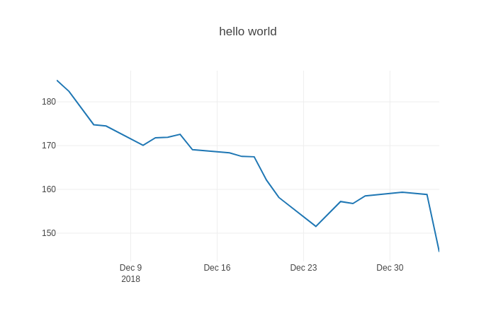
That gives you the stock data as a line graph.
If I missed anything, feel free to DM me on Twitter. Feel free to share this with friends and colleagues.